Cure, May 2019
Product Designer / Sketch, Origami Studio
Internal resource app concept to track and test backend routes.
Creating An Internal Testing Tool#
As members of Cornell AppDev, we often hear complaints of bugs that occur within our apps. One of our apps, Ithaca Transit, which provides students with the TCAT bus schedule and live tracking of its location, had various issues with its backend server this past semester. However, we often aren't aware of these problems, until someone tells us. To combat this issue, we decided to create an app to notify us when these bugs occur, particularly, through checking backend responses.

People want to use the TCAT bus reliably, but can't because bus schedules don't consider delays, and bugs that occur on Ithaca Transit are prolonged when no one is aware.
Our Vision#
Our vision was to automatically check routes of each app every 30 minutes, ensuring that the backend servers are running and responding normally.
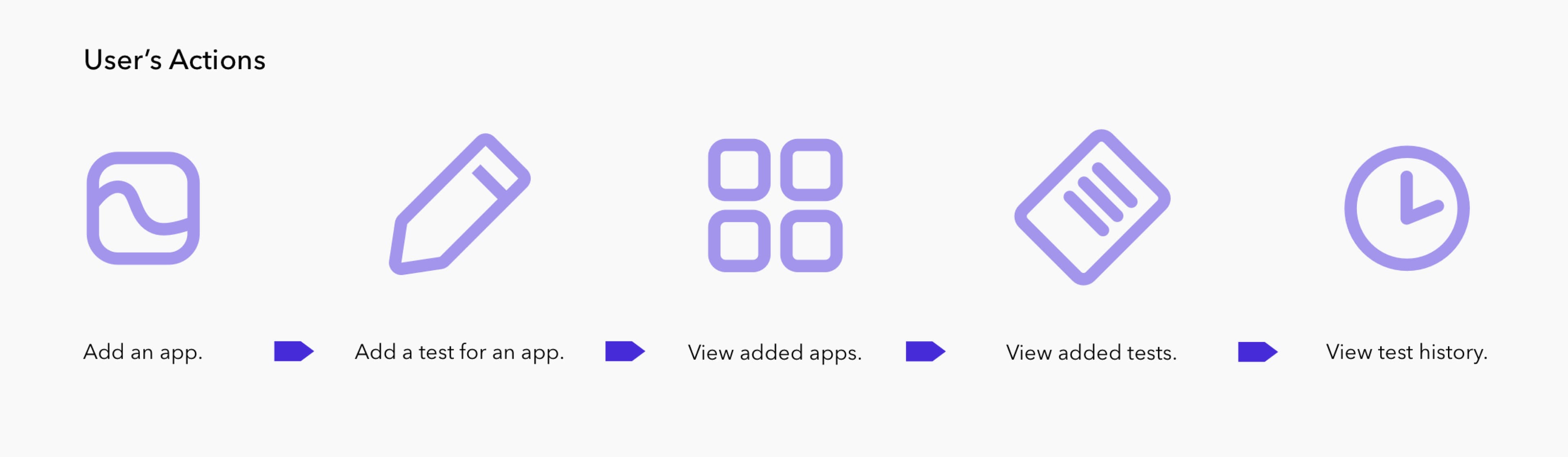
To tackle this problem, I brokedown the necessary features of Cure:
- A way to add an app and its server's endpoint.
- Some form of display for the added apps, so that they can be revisited.
- A way to tie specific tests to its respective app, defining its endpoint and parameters.
- Some form of display for the added tests, so that they can be revisited.
- A method to view test history.
Initial Structure#
Prioritizing Tasks
To find a starting point, I decided to prioritize the tasks. Because Cure was meant to be an internal tool for Cornell AppDev, there was no need for the dynamic input of apps. Thus, I believed the following would provide the most impact:
- Some form of display for our apps (Ithaca Transit, Uplift, Pollo, Eatery, Chatty Cathy).
- A page for each app to view and add specific route tests.
Home Screen & Adding Tests
With these two tasks in mind, I established an initial foundation for Cure's home page, and "add test" page.
Exploring Ideas
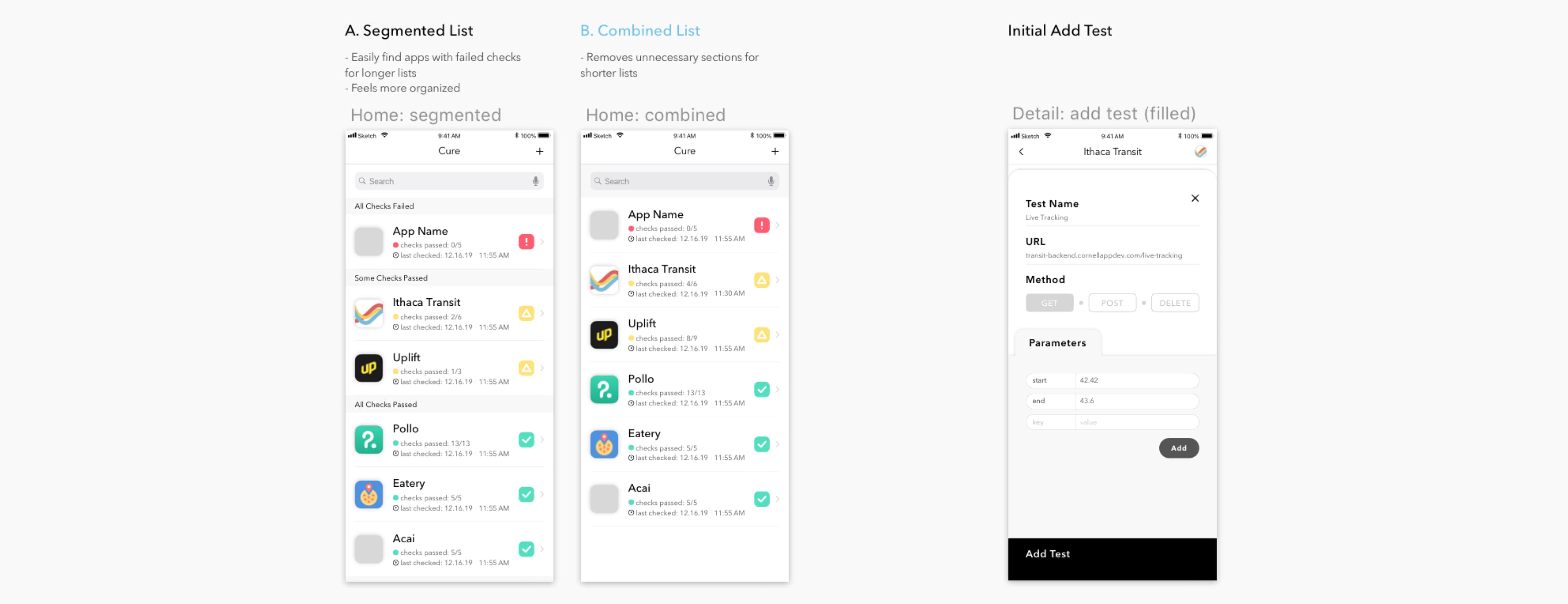
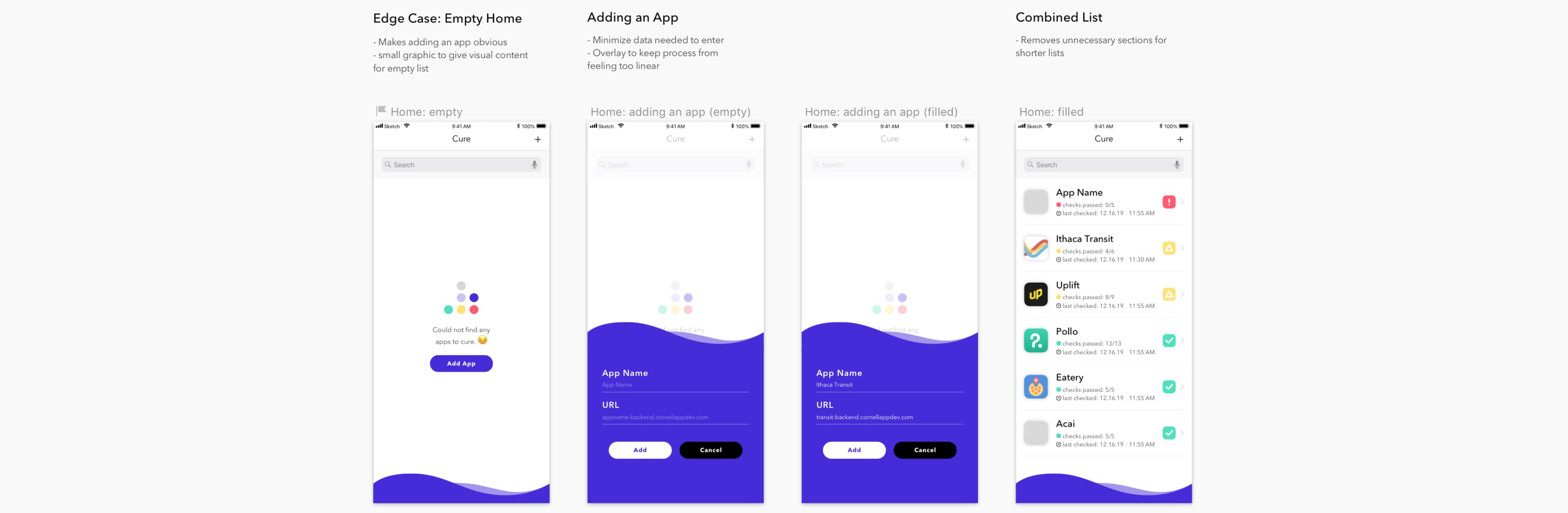
Structuring the Home Page:
For the home page, I thought to categorize the added apps by the result of their latest route checks as per Option A. However, because of the limited number of apps Cornell AppDev manages, the division was unnecessary. So, I sought to combine and sort them instead, as shown in Option B.
Structuring the "Add Test" Page:
As for the "add test" page, I went with an initial layout that kept key information on the top, and secondary information below.
Defining a Color Scheme#
Highlight Colors
The three main highlight colors were already defined as such:
- Green: all tests have passed
- Yellow: some tests have failed
- Red: all tests have failed
Brand Colors
To balance the green, yellow, and red, I went for an indigo as the main color.

Defining the Brand#
Building Waves
I structured Cure around the theme of waves to reflect the nature of route tests, something fluid and everchanging.
With this, I returned to the original home screen, adding a small footer to establish Cure's indigo colors. I then implemented the flow for adding a new app to Cure, which would entail user entries of the app's name and URL for its base endpoint.
Revisiting Route Tests#
Adding Color
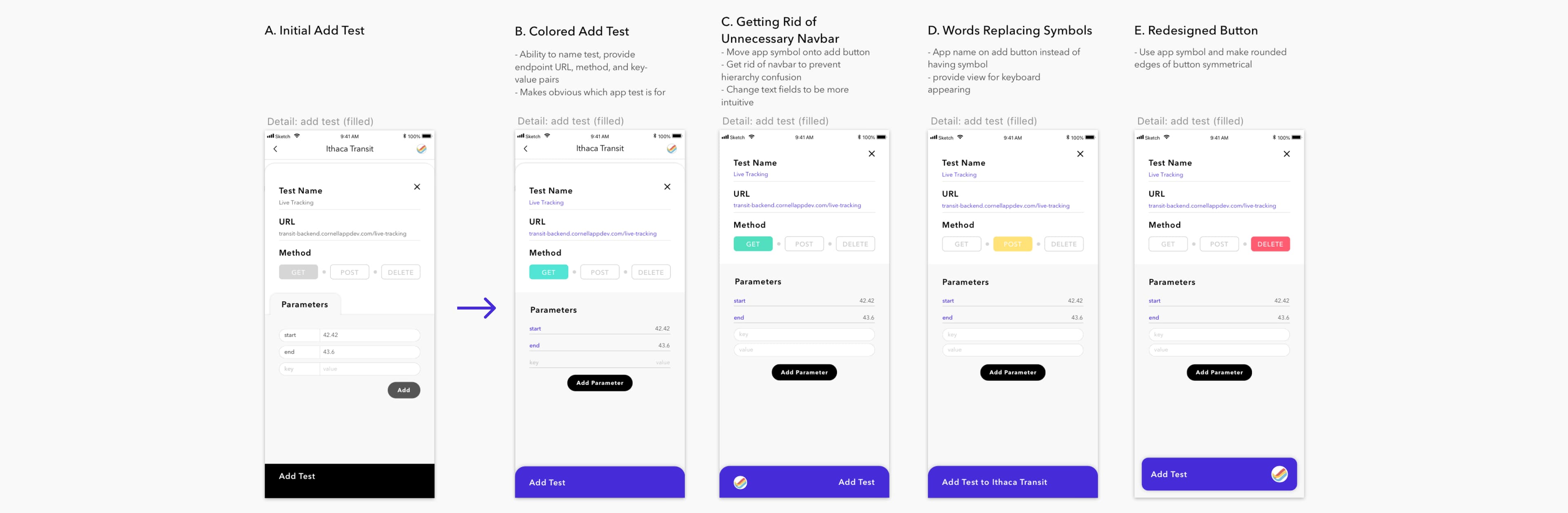
To iterate Cure's newly defined color scheme and branding, I changed the main inputs (test name and endpoint URL) to indigo, along with parameter keys, and the "add test" button. I used green, yellow, and red to further differentiate the selection for the test's request method. I then proceeded to revise the overall display of adding tests.
Exploring Ideas
Removing the Navbar:
The initial structures, Options A and B, had a navbar indicating which app the test would be added to. As per the example, we would be adding a live tracking test to Ithaca Transit. Options C, D, and E, however, removes the navbar to prevent hierarchy confusion. Would the "x" or back arrow navigate to the Ithaca Transit's prior state? What would the prior state be? By removing the navbar, the idea was to use the "x" to navigate back to the Ithaca Transit's detail page, which would then have a navbar for transitioning back to the home page.
Clarity of Words in "Add Test" Button:
However, from the removal of the navbar, how would we know that we're adding the test to Ithaca Transit? To solve this, Options C and E opt for a simple image of Ithaca Transit's icon on the "add test" button, whilst Option D displays the entire app's name. Because an app's icon may not be recognizable when cropped into a circle, I preferred the clarity of words in Option D.
Separate Rows for Key-Value Inputs:
To sort out the table of parameters, Options B, C, D, and E call for a cleaner look, removing unnecessary padding from the rounded borders of Option A. The parameter input style for Option B corresponds to previously added parameters, placing the key-value input on opposite ends of a single line. However, to give more room for key-value inputs, I decided to separate them into two rows, as shown in Options C, D, and E.
Final Result
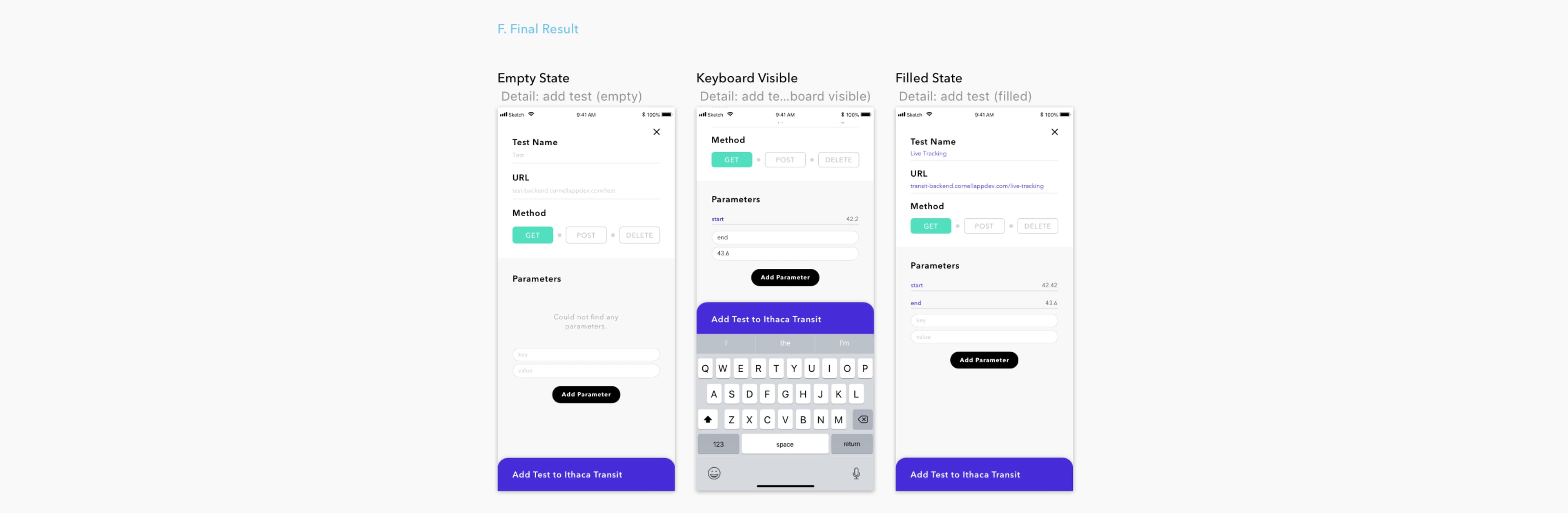
Combining the removal of the navbar, full name "Ithaca Transit" on the "add test" button, and separated parameter inputs, I created the flow of adding a test, as defined in Option F.
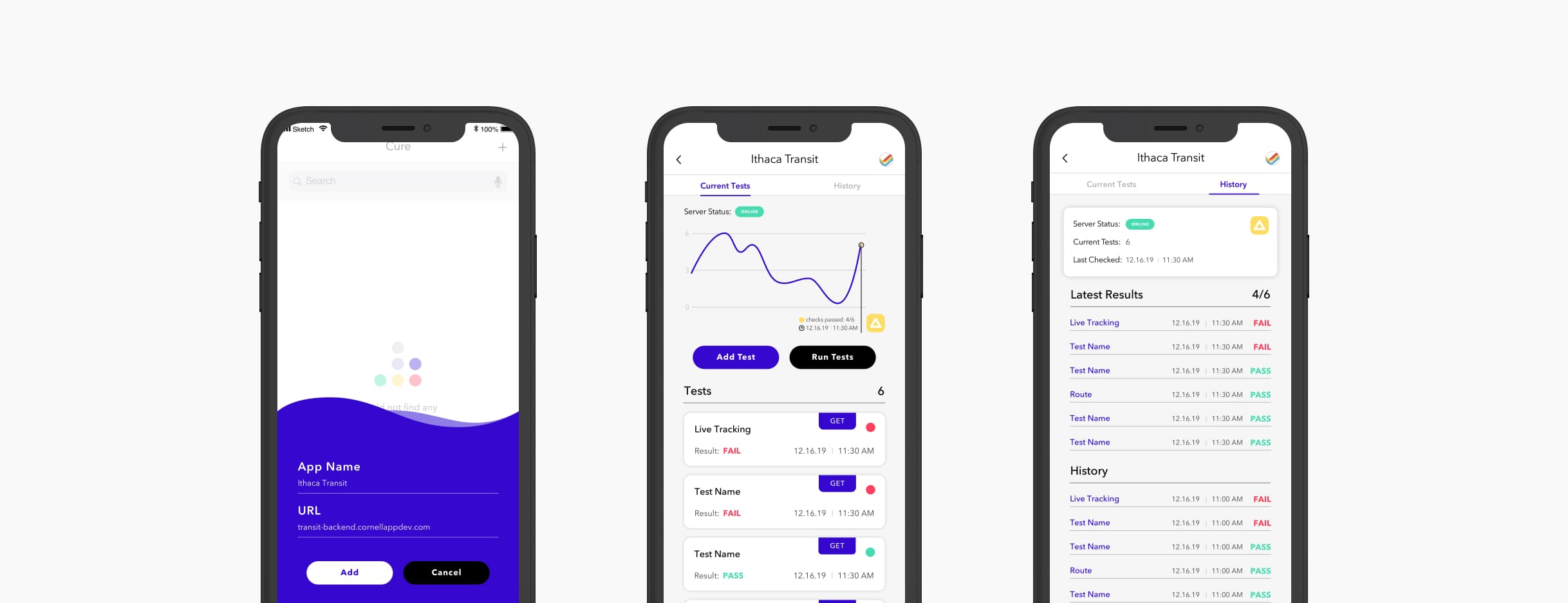
App Detail#
Establishing Key Information
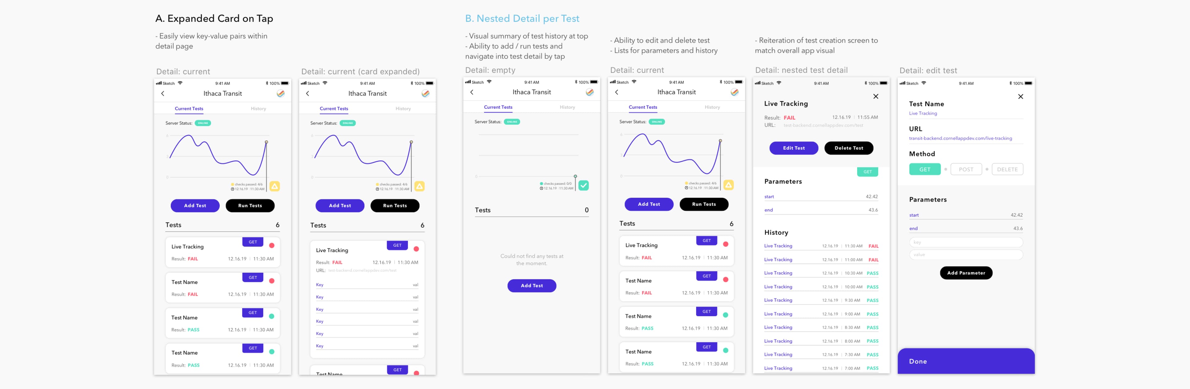
Now, the question was: how do we revisit these defined tests? Options A and B propose a detail page for the app, displaying key information at the top:
- Is the server online?
- A visual graph to depict past route checks.
- Actions for adding a new test, and manually running already-added tests.
The current tests added would then be listed below.
Exploring Ideas
Expandable Cards:
For this, Option A opted for an expandable card, displaying more information about the test, while remaining on the same page, allowing users to scroll through other tests as they wish. However, how might someone edit the test? Another button for each card would drive each tapping action to be unclear and counterintuitive.
Adding Actions Within a Nested Detail Page:
So, with Option B, I chose to have a nested detail page for each test. Much like the structure of the app's detail page, key information would be highlighted at the top, with clearly worded buttons for editing and deleting the test. Further information, such as the test's parameters and past route checks, would be listed below.
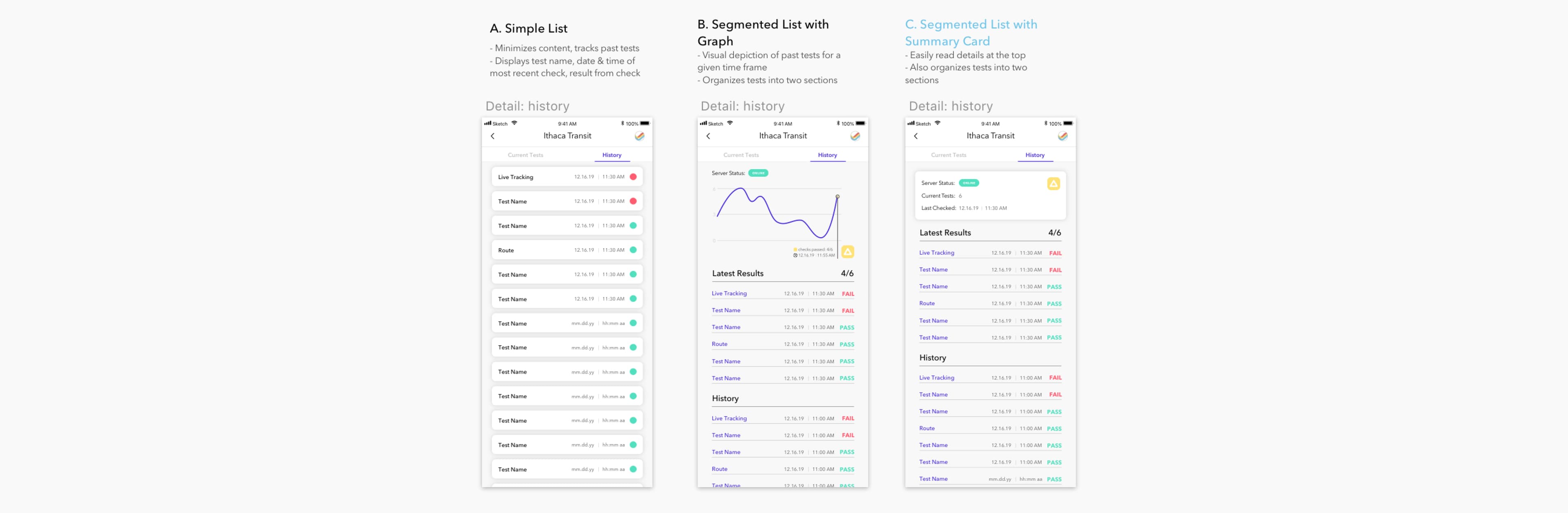
Test History#
Exploring Ideas
A Simple List:
With the history tab, I started off with Option A as a simple list, displaying past tests, sorted by their date and time. Most recent route checks were displayed at the top. Nonetheless, Option A does not have much visual hierarchy.
Reusing Section Graph:
To establish visual hierarchy, Option B proposes to reuse the section and graph from the current tests tab, and separates the app's latest test results, from prior results. With this, the tests are easier to visually distinguish. However, the graph of Option B takes up too much space, considering the amount of past checks that would be listed under "history".
Replacing the Section Graph With a Card:
So, I opted for Option C, which compresses the key information into a shorter summary card, whilst still dividing past checks between latest results and prior results.
Conclusion#
Misleading bus arrival times affect many students who rely on public transportation, especially on a large campus like Cornell. Cure prevents the prolongation of these app issues, providing developers a tool for maintaining their apps, through tracking their backend server responses.