Netflix Playlists, Jan to May 2019
Product Designer / Sketch, Origami Studio
Redefining the way people can interact and create community through collaborating, sharing, and organizing favorite shows and movies.
Originally published on 5/20/2019 via ↗ Medium.
Integrating Playlists#
As a college student with finals season approaching, it's that time of year again, to use up the two homework drops you saved up for weekly problem sets, and start binging shows again. But at this point in life, you've probably watched enough to run out of quality content. Exam stress is enough. No one should have to stress over finding a good show. Netflix allows users to discover and watch shows, but many people have been moving over to other platforms because they feel frustrated from the repetitiveness of suggested content.
Finding New Shows#
Market Research
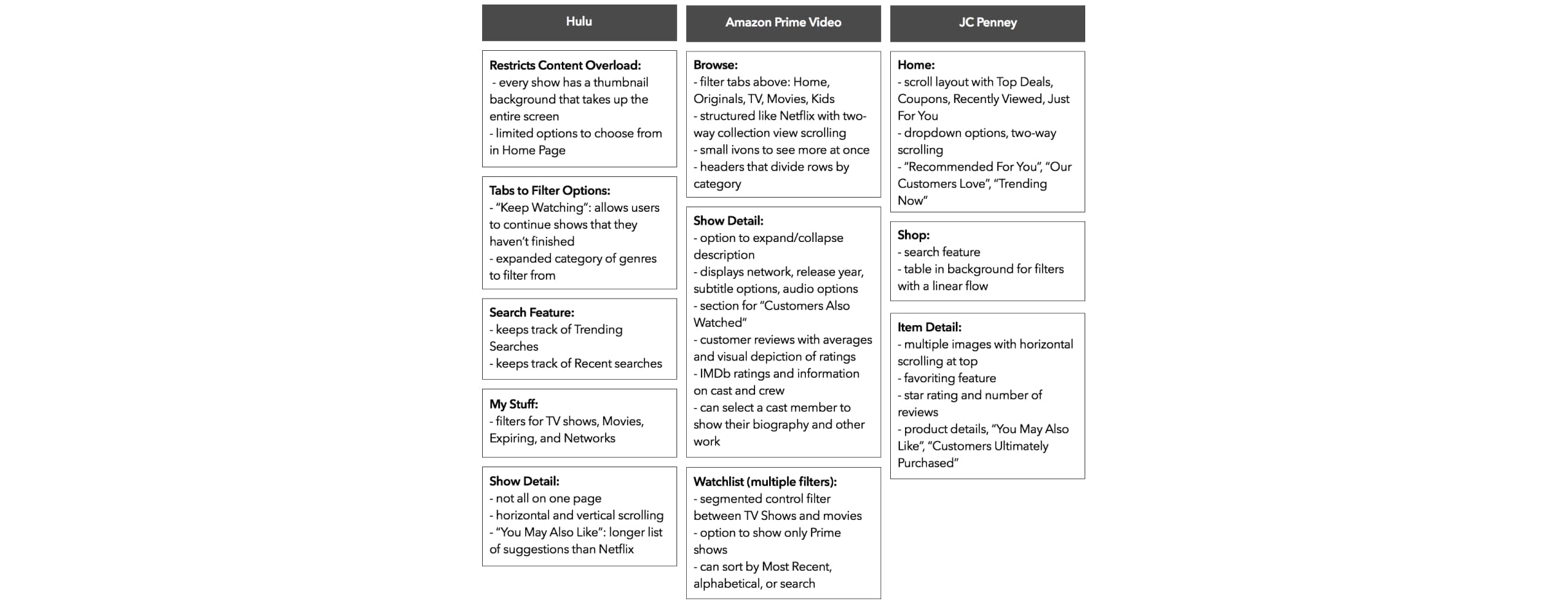
The main problem with finding new shows on Netflix is that there are too many options to choose from. I wanted to understand how current markets tackled this issue of searching for new things. Some of the implementations I looked at were Hulu, Amazon Prime Video, and JC Penney.
Here were my key findings:
- All the apps have some sort of genre-filtering option.
- Users can activate multiple filters on Amazon Prime Video and JC Penney.
- Amazon Prime Video and JC Penney have user reviews with visual depictions.
- Users can see more without having new pages pop up with vertical and horizontal scrolling.
- Amazon Prime Video has more information on shows. The cast/crew listing and page for other work done by the member was more obvious to find.
- The apps feel personal, with phrases saying "You May Also Like," "Recommended For You," "Just For You," and "My Stuff."
User Research
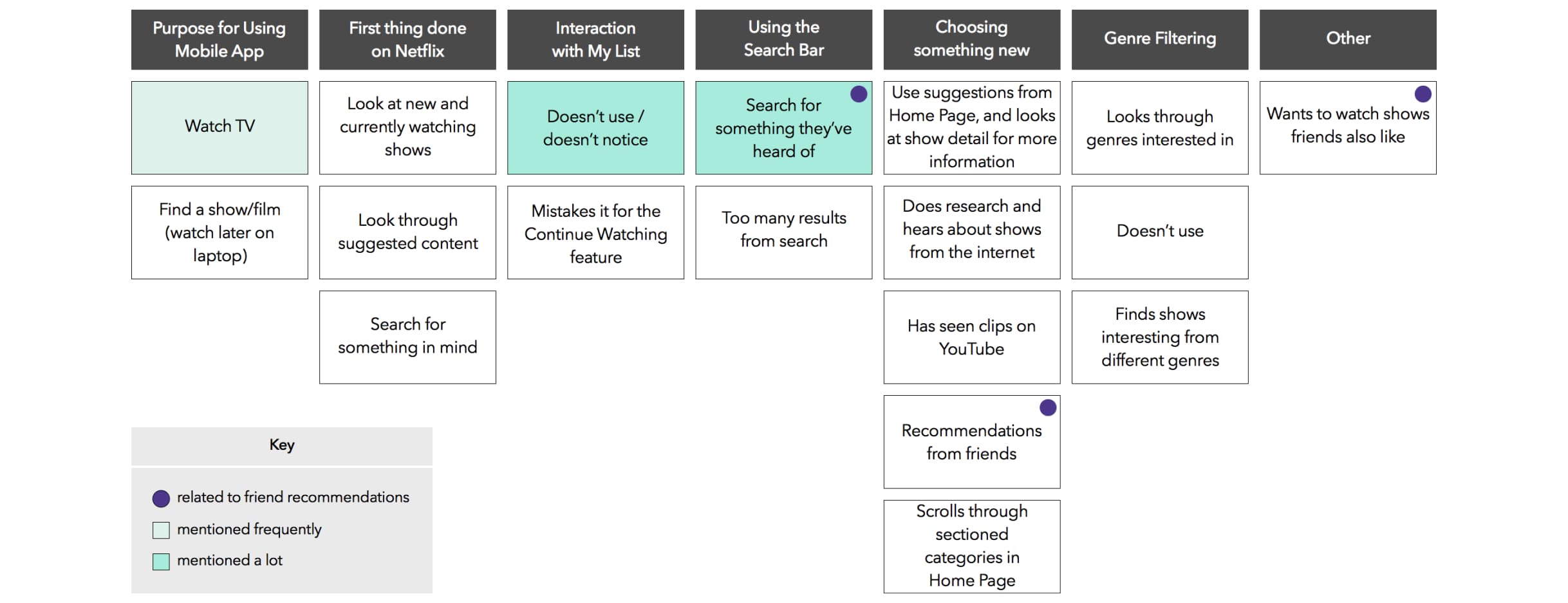
With a general idea of alternate implementations, my goal in interviewing Netflix users was to identify key pain points in finding new media on Netflix. Some things I considered were:
- How do viewers engage with genre/search filtering on Netflix?
- Do users have preferences on watching trailers versus reading descriptions of new media, and why would they prefer one over the other?
- How do viewers feel about the "My List" feature? The key insights that I found were:
- People don't tend to notice or use My List.
- People get insight on shows from other sources, whether it's their friends, or the internet, and come to Netflix with a show in mind.
- People take a long time scrolling through lists in the home screen.
Brainstorming
Initially, I thought people just wanted to see new blockbusters, or currently-airing shows. But every conversation brought me to the same point — people are more likely to express interest in a show if someone they know have recommended it.
People usually find new shows through the influences of their friends, because they trust people, and their opinions. But they have a hard time keeping up with others, and gathering all the information in one place.
To find solutions, I spent a not-so-sunny afternoon indoors with my friends Amanda and Young.
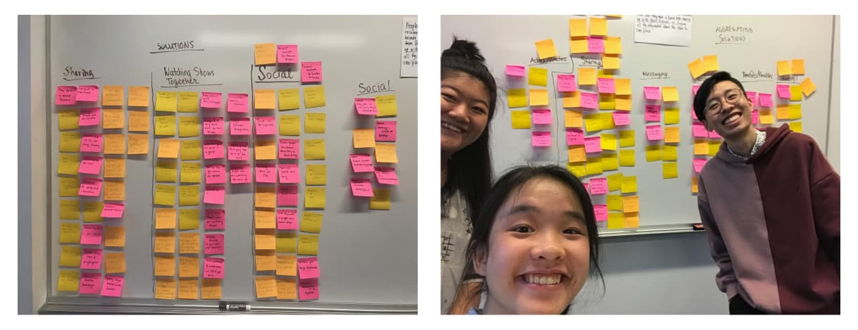
We started off by ideating what possible problems may rise. Some points we noted were how might we…
- Ask others for recommendations
- Integrate with existing social networks
- Connect people who watch the same shows
- Help friends stay in touch with what they're watching
- Share recommendations / preferences / favorite shows
…which were later aggregated into 4 groups — Social, Recommendations, Watching shows together, Sharing.
From these, we focused on creating solutions for these problems. 3 potential solutions I considered were:
- Show "playlists"
- Event planning for show watching
- Netflix leaderboards / achievements
Event planning held the least impact, as there are many other methods to schedule viewings, such as Facebook events, or even a simple text message.
And because Netflix already groups and filters content (by genre, what's trending, what's popular, etc.), show "playlists" was the most feasible solution, whereas event planning and achievements would require entirely new features.
Implementing "Netflix Playlists"#
After considering high feasibility and impact, I opted to implement Netflix Playlists, allowing users to collaborate, organize, and share shows with their friends.
3 main features of Netflix Playlists I focused on were:
- How might someone add/edit a playlist?
- How should someone find their friend's playlist?
- What interactions with playlists will be beneficial to the user?
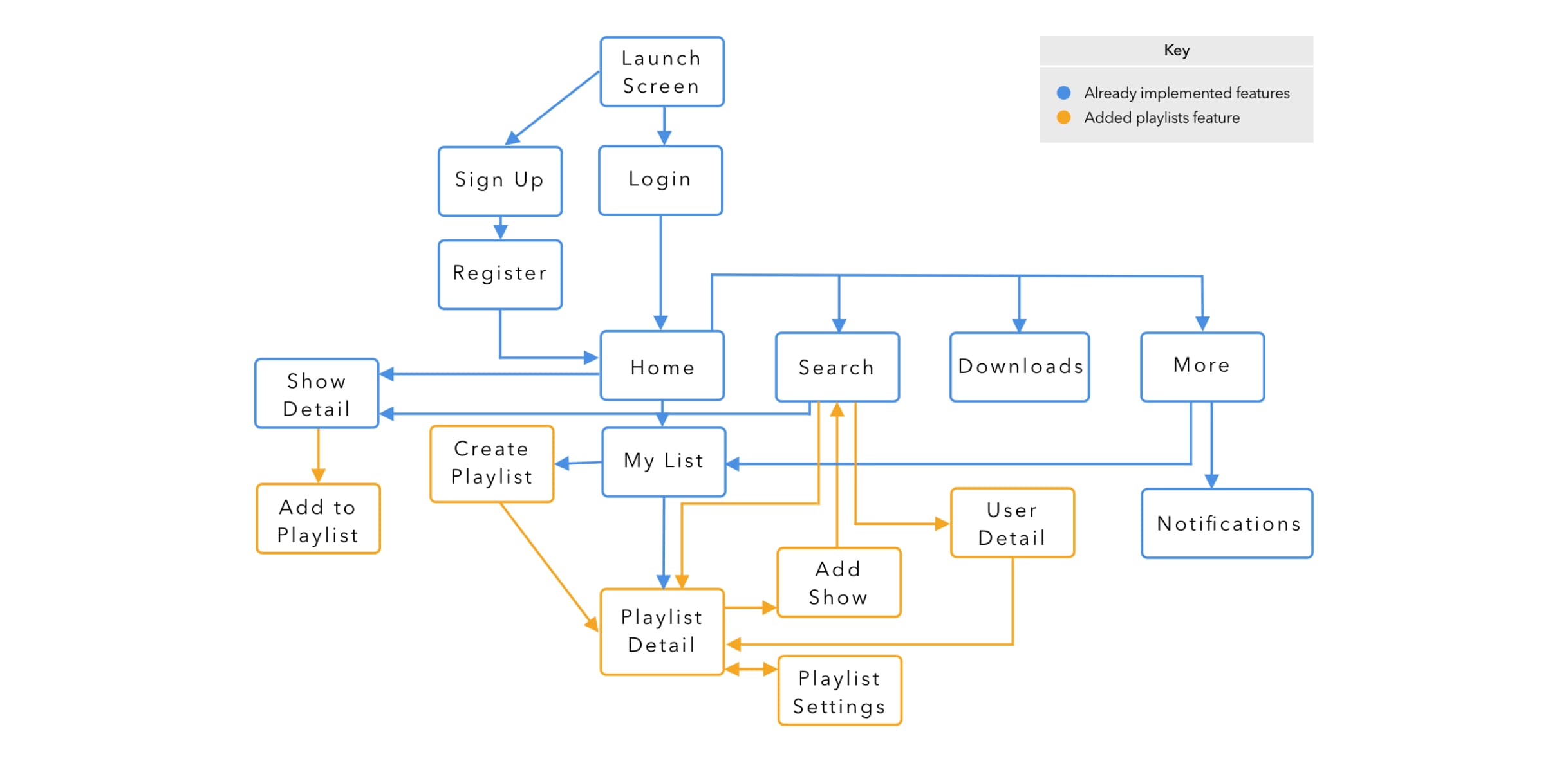
Where Does It Fit In?
Because playlists were something completely out-of-ordinary with the rest of Netflix, I started off with quick blue and orange colored diagram, highlighting how people would find and interact with Netflix Playlists.
First Look
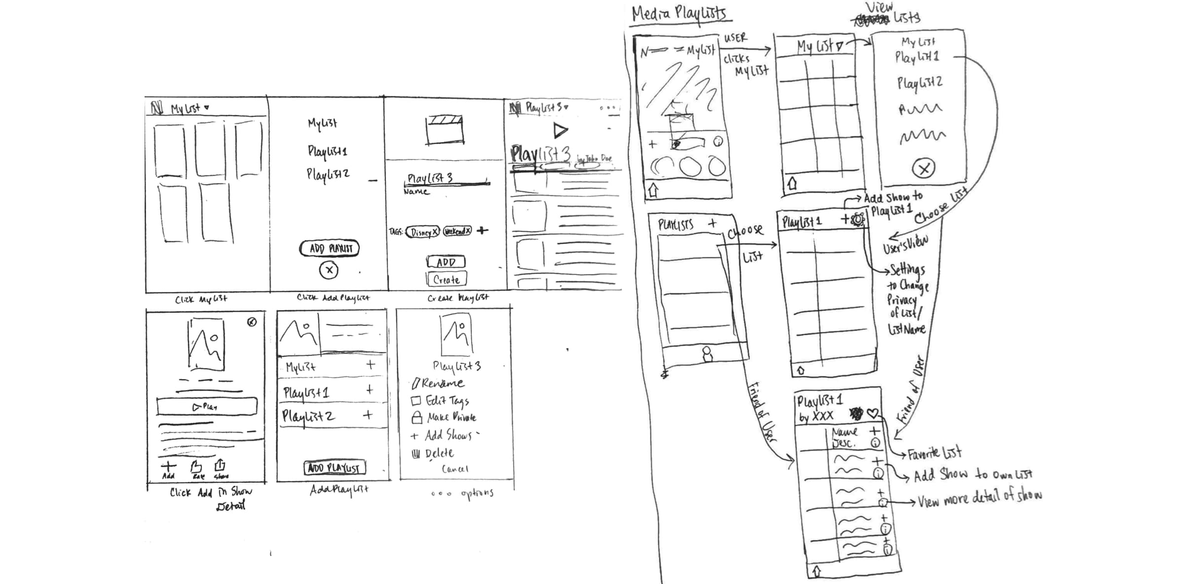
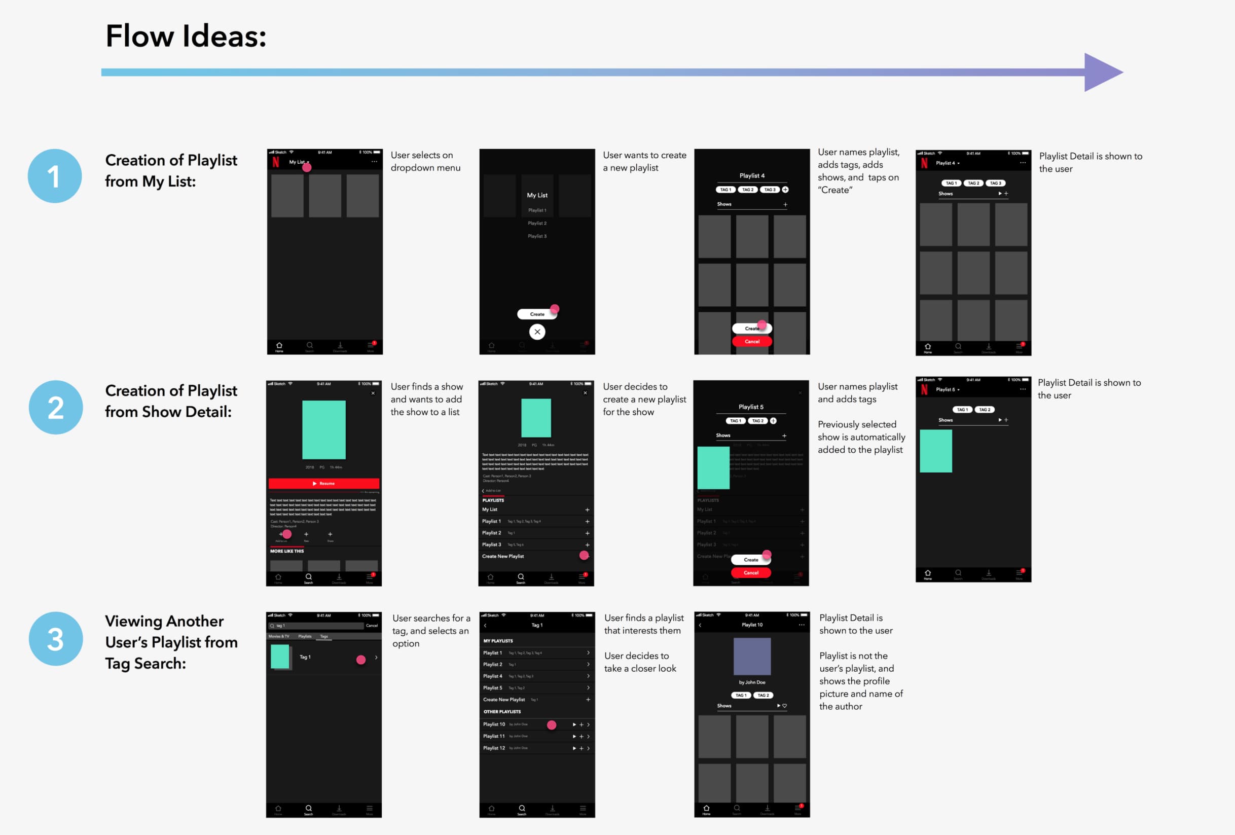
With a hierarchy in mind, I created some quick sketches to explore different entry points in finding the playlist detail. I later polished these sketches with some interactions in mind:
- organizing playlists using tags (similar to that of Instagram posts)
- creating a playlist: navigation to creation view, naming playlists, adding tags, adding shows
- finding a friend's playlist: integrating playlists within the search bar, favoriting playlists
This resulted in three main entry points — My List, the show detail, and the search bar.
A Home for Playlists#
After talking to a few people, I realized that…
- People responded to words more than symbols. Plus signs were confusing, and led users to question what they were adding.
- The existence of the playlist feature was not as obvious as I had hoped from my three entry points.
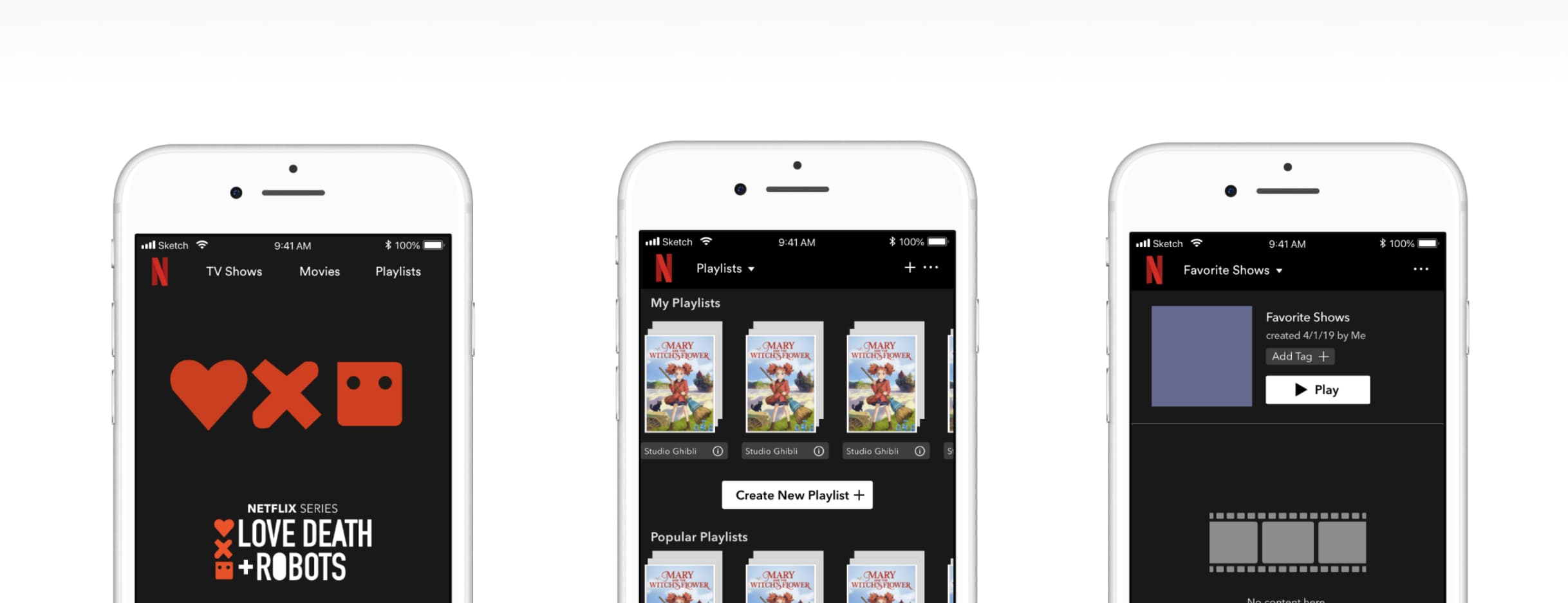
Because of this, I decided to add a playlist browse, recreate some of my button icons, and integrate playlists within the Netflix home screen, focusing on the process of creating a playlist.
The main points I considered were:
- making actions easier to find and understand
- making playlists easier to notice
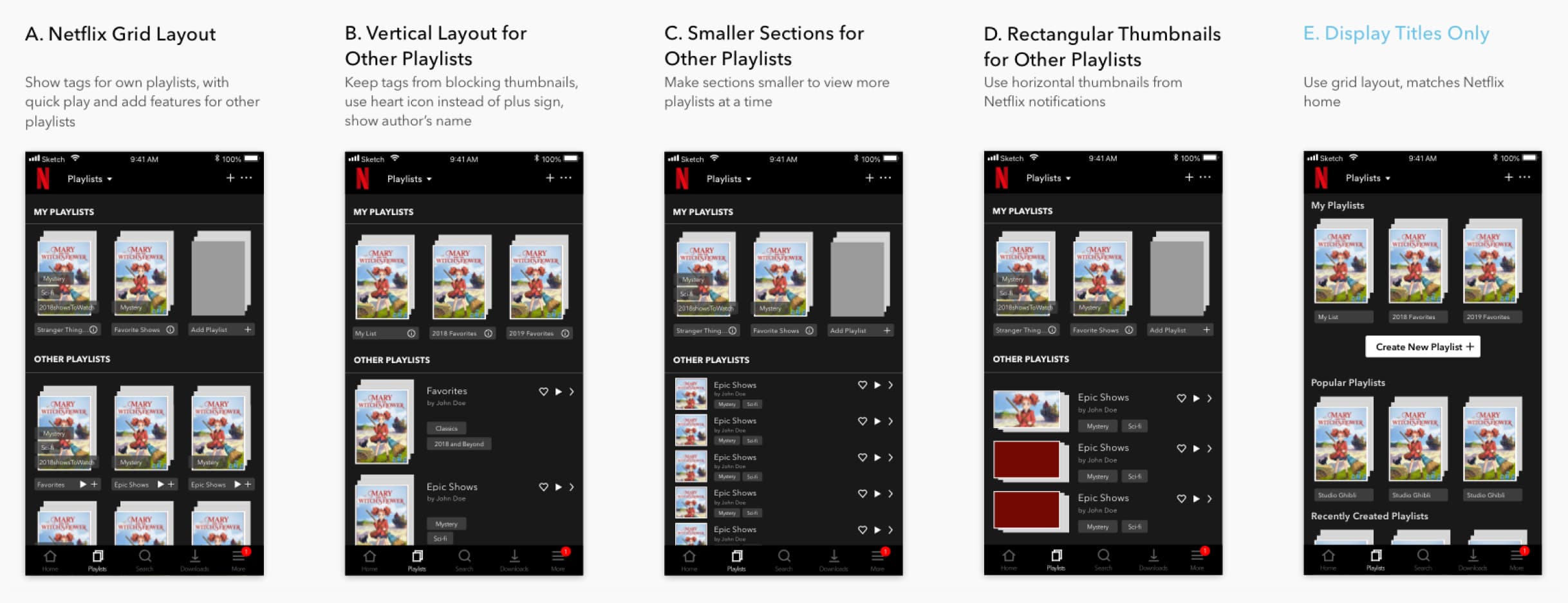
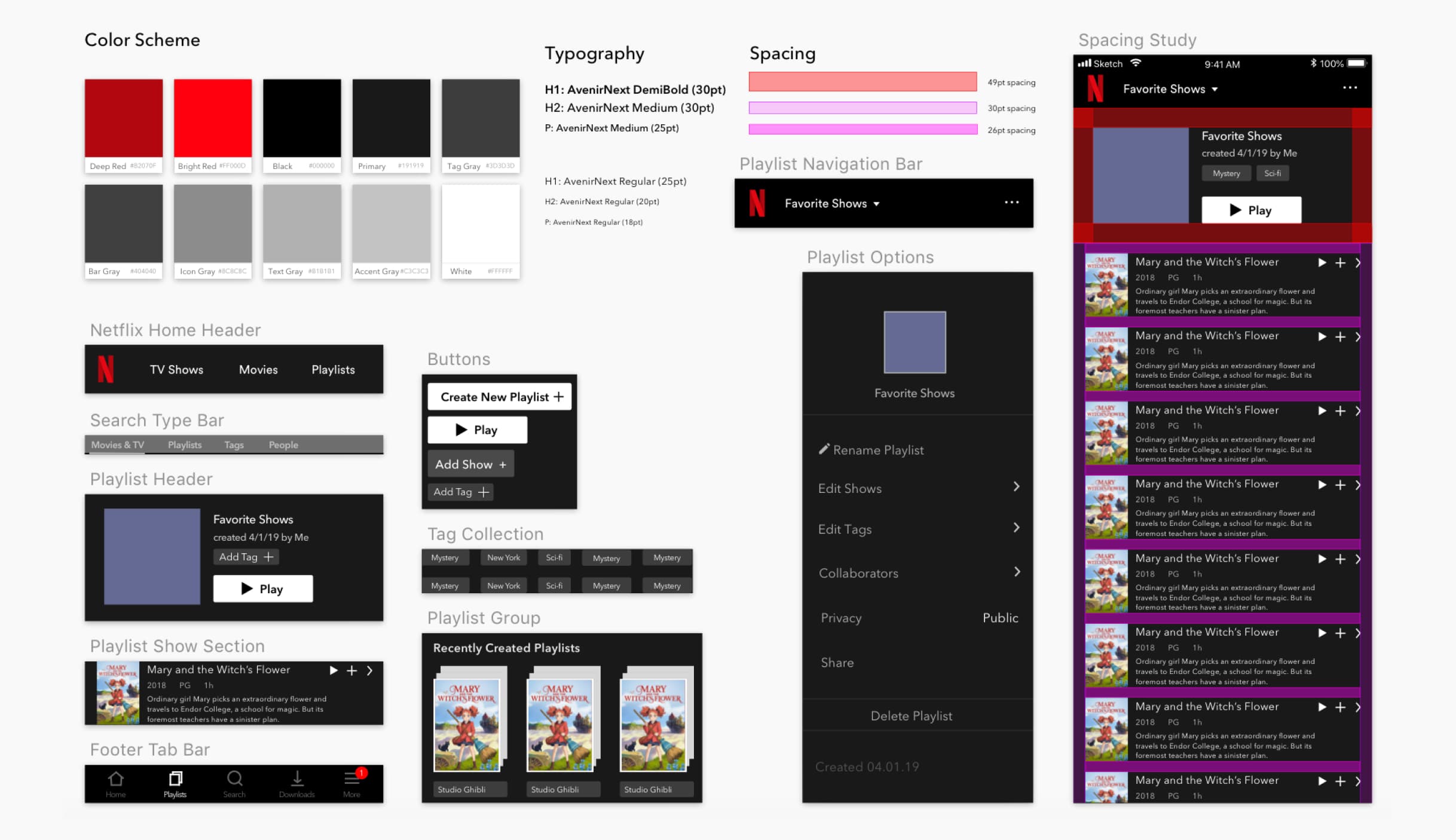
I explored 5 variations of the Playlist Browse, weighing the ability to display more variety of playlists, available actions within the same screen, and inclusion of information. Options A, B, C, and D all include playlist tags with quick play and favoriting features, though B only presents tags for Other Playlists, and not a user's own playlists. The vertical layout of B, C, and D gives more room for playlists with longer names, and also features the author's name. All iterations included a tab bar option for playlists. Nonetheless, the tags of A, C, and D blocked thumbnails, the smaller square thumbnails of C were hard to see, and the larger thumbnails of B and D made scrolling cumbersome.
I opted for Option E.
Option E adapts Netflix's current home screen solution to the Playlist Browse. Though E displays less information, it allows for playlists to be grouped and easily explored through horizontal and vertical scrolling, and its Create New Playlist button makes playlist creation plain and obvious. I kept the plus sign button in the navigation bar for painless access while scrolling through the Playlist Browse.
Making It Happen
Of course, what happens once we click the big, white Create New Playlist button?
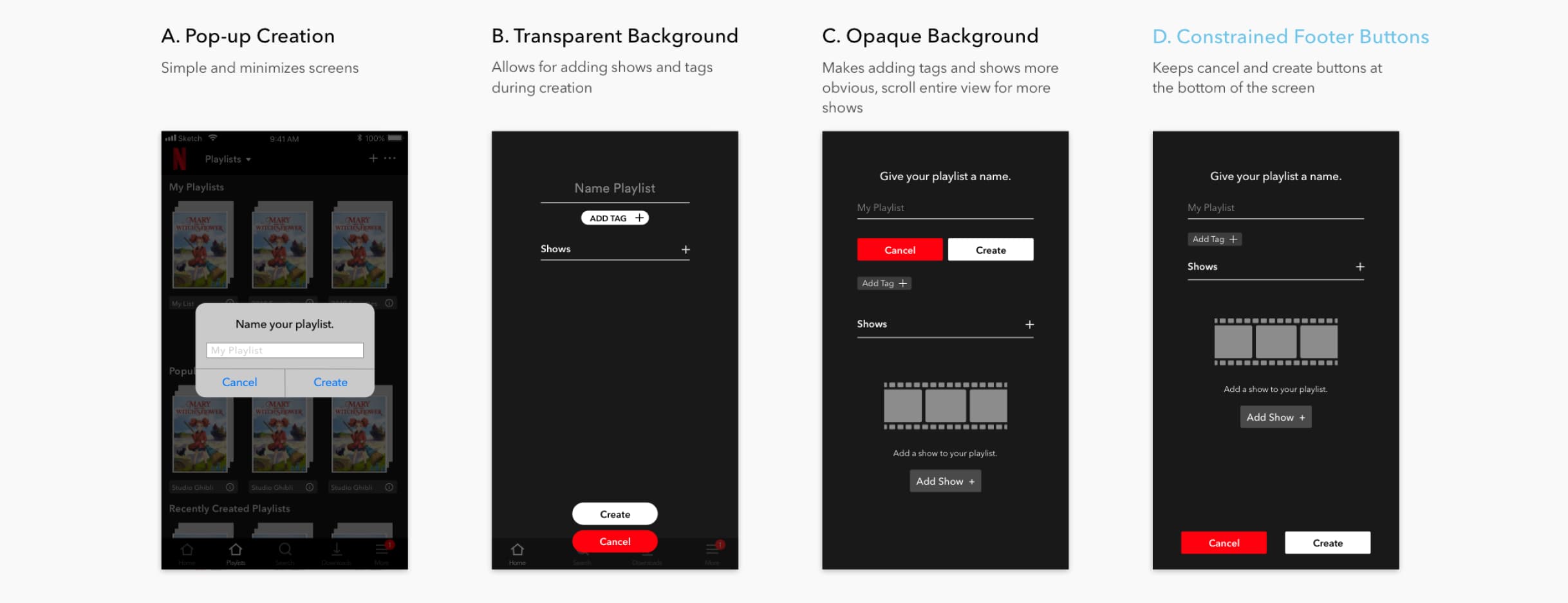
Taking some inspiration from Spotify, Option A allows for a fast, clean playlist creation with a simple pop up that minimizes screen navigation — it just prompts the user to enter a name. However, this deviated from Netflix's style, and limited mobility. With B, C, and D, a full creation screen gives space for naming, adding tags, adding shows, and displaying shows. This provides users the option between adding now, and adding later. Despite that, users found the simplicity of B confusing, as there is not much context given.
To eliminate confusion and make actions obvious, I added more text and chose word-oriented buttons, shown in C and D. At first, I thought about separating necessary and optional inputs with the Cancel and Create buttons, but I decided to constrain the buttons as shown in D to create a sense of unity within the screen, whilst allowing for convenient navigation once the playlist is populated with shows.
So, I opted for Option D.
The Center of Action
Where would people find the grouped shows of playlists? One of the main features of Netflix Playlists is, as expected, the Playlist Detail.
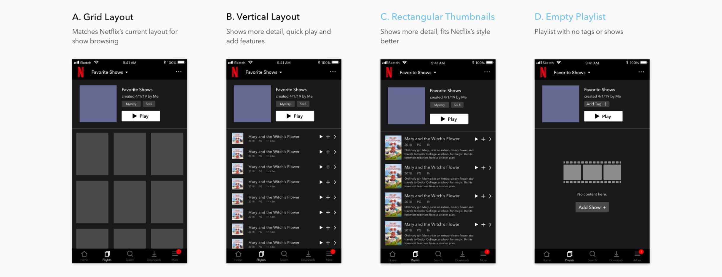
With the display of information, visuals, and effortless navigation in mind, I started off with Option A, implementing Netflix's signature grid layout. However, with the consideration of social activity and sharing in mind, I explored vertical scrolling with quick play and adding features, shown in B and C. The thumbnails of C match Netflix's rectangular style better, but lacks the ability to display a greater quantity of shows. Nonetheless, I revisited the problem space that Netflix Playlists was solving — finding a way to collaborate, organize, and share shows with friends. This meant that playlists were for containing smaller groups of shows, so the previous problem of cumbersome scrolling in the Playlist Browse would not occur.
So, I opted for C, and added D as an edge case for an empty playlist.
Playlist Options
But what happens once a playlist is created? Perhaps you've last-minute fumbled and accidentally left a typo. Users will want to rename their playlist, and edit, delete, or add new tags and shows. The Playlist Options contains these actions in one place.
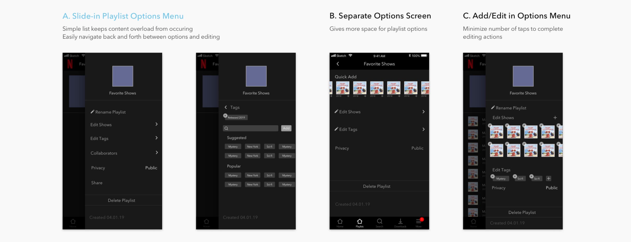
Option B gives more space, with a feature to quick add shows to a playlist. However, the separate screen makes editing actions feel very linear, and the scarcity of content builds too much white space. With A and C, a slide-in options menu allows for a one-step navigation back to the Playlist Detail, by tapping on the darkened layer underneath. Although C minimizes taps for deleting, I found that A was a better choice because of its cleanliness. The vertical ordering of options in A keeps actions self-explanatory, and there is no hidden content within the same view as in C, where horizontal scrolling on a slide-in menu may be awkward.
So, I opted for Option A.
Adding Shows and Tags
After determining the general layout and features of Netflix Playlists, I moved onto exploring the smaller actions within playlists, looking at what exactly happens while adding shows and tags.
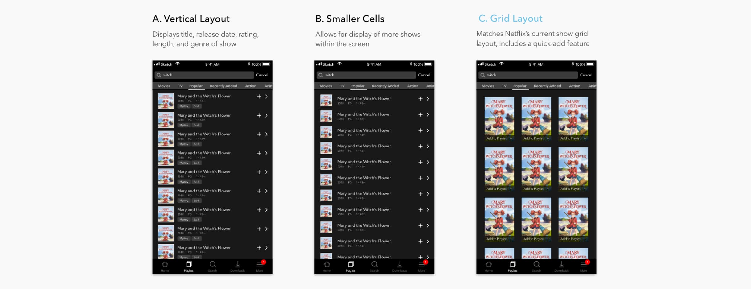
The general idea I had for adding shows was to reuse Netflix's search screen, but have a quick add option, while allowing for users the choice to view the show detail. With Options A and B, the vertical layout lets users scroll, while keeping taps towards the right. The wider sections gives room for longer titles, and more detail.
However, I went with Option C.
Option C sticks with Netflix's current grid layout for shows, and the larger thumbnails are easier to read.
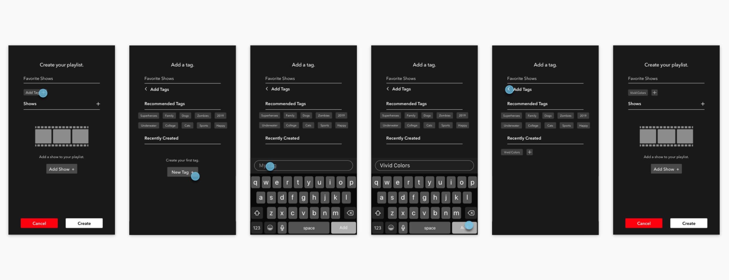
As for editing tags, the structure had been previously implemented within the Playlist Options, so I focused on adding tags within the playlist creation layout. To match the design with Netflix and previous implementations, I reused the header of the playlist creation and tags visuals. The sections for recommended and recently created tags helps keep the view from feeling too empty, whilst allowing suggestions for users.
Final Interaction#
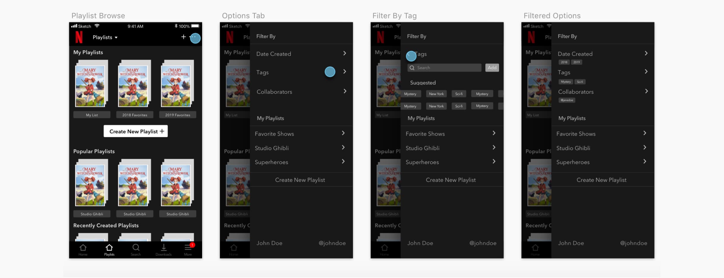
Playlist Browse Filtering
Adding Shows
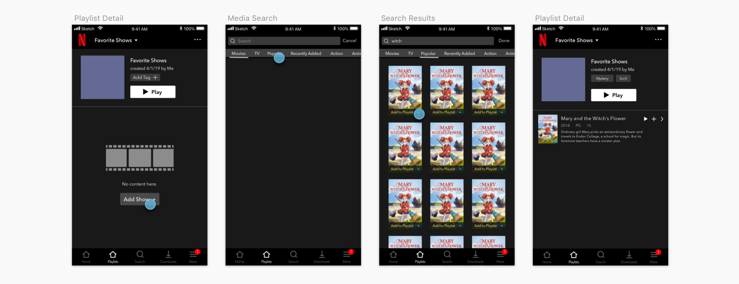
Above are the depictions of Playlist Browse Filtering and Adding Shows. View the prototype videos below for the flow of Creating Playlists, Playlist Options, and Accessing Playlists.
Creating Playlists
Playlist Options and Adding Shows
Accessing Playlists
Conclusion#
Netflix brings a place for people to enjoy shows at home, but misses the social aspects of spending time with friends and going to the movie theatre. Netflix Playlists presents a potential way for people to collaborate, discover, and enjoy shows together.